# Filters
The `filter` style runs a chain of GPU shader passes over a node's rendered
result: the node itself and its whole subtree, as one image. bevy-react
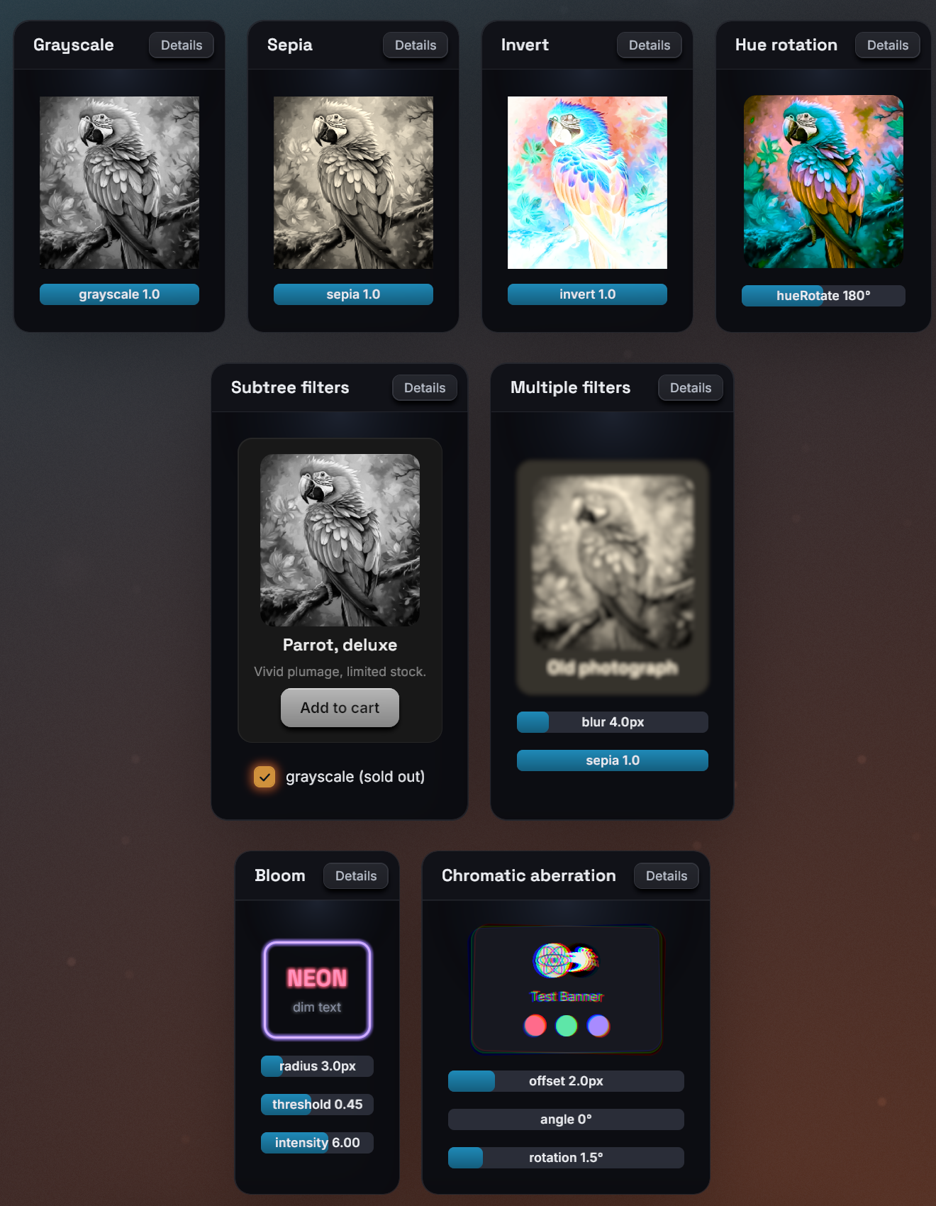
ships fourteen filters (blur, color adjustments, bloom, drop shadows,
outlines, gradient recolors and a pinch distortion), and apps can register
their own.
## Usage
```tsx
```
A chain runs its entries in array order, each one over the previous one's
output:
```tsx
Old photo
```
## Chains
The value is one `{ name, params }` entry or an ordered array of entries.
- `params` and every param in it are optional. An omitted param takes the
filter's default, which for built-ins is a visible effect, unlike CSS: a
bare `{ name: "blur" }` is a 20px blur, and a bare `{ name: "grayscale" }`
is full grayscale.
- Names and params are typed from your generated `bevy.ts`, which lists the
built-ins and your own filters (see
[TypeScript codegen](../tooling/ts-codegen.md)). Without generated
bindings the field accepts no value.
- Length params take a number of logical pixels or a string like `"12px"`. Angle
params take degrees, or a string such as `"0.5turn"` or `"1rad"`. Color
params take a CSS color string.
- An entry with an unknown name is skipped with a `filterUnknown` devtools
warning, and an entry with invalid params (an unknown param, a `%` blur
radius) with a `filterParams` warning. The rest of the chain still runs.
- Morph filters (`crossfade`, `linearWipe`, `pixelize`) belong to
[`morphFilter`](morph-filters.md) and are rejected here the same way.
- An empty array is the same as no filter.
## What gets filtered
- A non-empty `filter` promotes the node to a
[composited layer](layers.md): the subtree is rendered into a texture
once, and the chain runs over that texture. Changing a param re-runs only
the filter passes, not the content, so animating params is cheap.
- The image includes the node's own background and border. It works on a
leaf too: an ``, a `` or an empty colored ``.
- Filters that reach outside the content (a blur, a glow, a shadow, an
outline) enlarge the layer by their reach on every side, so their effect
is not cut off at the node's edge. The reach of a chain is the sum of its
entries' reaches.
- An ancestor's `overflow` clipping clips the filtered result, as on the
web.
- `opacity` on the same node fades the filtered result as a whole.
- `filter` and [`backdropFilter`](backdrop-filters.md) are independent and
can be combined on one node.
## Built-in filters
Each table lists the params and their defaults. Lengths are logical pixels
and angles are degrees.
### Color adjustments
Each takes one param and recolors every pixel, keeping its alpha:
| Filter | Param | Default | Effect |
| ------------ | -------- | ------- | ------------------------------------------------------- |
| `brightness` | `amount` | `1` | Multiplies the color: `0` is black, above `1` brightens |
| `contrast` | `amount` | `1` | Scales the distance from mid-gray: `0` is flat gray |
| `saturate` | `amount` | `1` | `0` is grayscale, above `1` oversaturates |
| `grayscale` | `amount` | `1` | Mix toward grayscale: `0` none, `1` full |
| `sepia` | `amount` | `1` | Mix toward sepia: `0` none, `1` full |
| `invert` | `amount` | `1` | Mix toward the inverted color: `0` none, `1` full |
| `hueRotate` | `angle` | `0` | Rotates the hue around the color wheel |
The defaults follow CSS: `brightness`, `contrast` and `saturate` default to
no change, `grayscale`, `sepia` and `invert` to the full effect.
### `blur`
A Gaussian blur.
| Param | Default | Effect |
| -------- | ------- | --------------------------------------------------- |
| `radius` | `20` | Blur radius; the blur reaches three times this far. |
### `bloom`
A glow: bright areas bleed light over their surroundings.
| Param | Default | Effect |
| ----------- | ------- | ---------------------------------------------------------- |
| `radius` | `12` | How far the glow spreads (it reaches three times this far) |
| `threshold` | `0.7` | Brightness (`0` to `1`) above which pixels glow |
| `intensity` | `1` | Strength of the glow added on top; `0` is no effect |
`threshold` is perceived brightness: `1` makes nothing glow, `0` makes
everything glow.
### `chromaticAberration`
Color fringing: the red channel shifts one way, blue the opposite way, and
green stays.
| Param | Default | Effect |
| ---------- | ------- | ----------------------------------------------------------------------- |
| `offset` | `4` | Shift distance of the red and blue channels |
| `angle` | `0` | Shift direction, clockwise from the +x axis (`0` is right) |
| `rotation` | `0` | Swirl: red turns this many degrees about the center, blue the other way |
`rotation` is a plain number of degrees (no unit strings). The swirl grows
toward the edges and leaves the center clean.
### `gradientMap`
Recolors the content with a linear gradient laid across the node, keeping
the content's alpha. On text, this is gradient text.
| Param | Default | Effect |
| -------- | ---------------------- | ----------------------------------------------------------------------- |
| `angle` | `0` | Gradient direction: `0` points up, clockwise, like `backgroundGradient` |
| `stops` | `#38bdf8` to `#a78bfa` | Up to six `{ color, position? }` stops |
| `amount` | `1` | Mix from the original color (`0`) to the gradient (`1`) |
```tsx
Gradient
```
- `position` is a fraction from `0` to `1` along the gradient line, not a
percentage. Missing positions are spread evenly, as in CSS.
- The gradient spans the node's border box; the reach of other filters in
the chain does not stretch it.
- A stop's alpha scales the mix locally: a transparent stop leaves the
original color.
- Colors interpolate in linear RGB, which can differ slightly from the same
stops in `backgroundGradient`.
### `outline`
A ring of color around the content's silhouette, drawn under the content:
outlined text, sticker-style icons.
| Param | Default | Effect |
| ---------- | --------- | --------------------------------------------------------------- |
| `width` | `2` | Ring width |
| `color` | `"black"` | Ring color |
| `softness` | `0` | Feathers the outer edge over this many more pixels, like a glow |
The outline follows whatever the chain has produced so far:
`[gradientMap, outline]` outlines the recolored glyphs.
### `shadow`
A drop shadow of the content's silhouette, like CSS `drop-shadow()`, drawn
under the content.
| Param | Default | Effect |
| --------- | ----------------- | -------------------------------------------- |
| `color` | `rgba(0,0,0,0.6)` | Shadow color |
| `offsetX` | `0` | Horizontal offset; positive moves right |
| `offsetY` | `4` | Vertical offset; positive moves down |
| `spread` | `6` | Blur radius of the shadow (not a CSS spread) |
Unlike `boxShadow`, which shadows the node's box, `shadow` follows the
shape of what is drawn: glyphs, transparent images, rounded children.
### `pinch`
Squeezes the content toward a point, or bulges it away, with optional
lighting that shades the distortion like a dented surface.
| Param | Default | Effect |
| --------------- | ------- | ------------------------------------------------------------------ |
| `x`, `y` | `0.5` | Center of the effect, `0` to `1` across the node |
| `strength` | `0.5` | `1` is a full pinch, `-1` a full bulge, `0` no effect |
| `radius` | `0.8` | Size of the effect, as a fraction of the node's larger side |
| `light` | `0` | Diffuse shading; `1` is nominal, more overdrives |
| `lightAngle` | `-135` | Where the light comes from, clockwise from +x (`-135` is top-left) |
| `gloss` | `0` | White specular highlight; `1` is nominal |
| `glossSize` | `0.3` | Highlight size, from `0` (a pinpoint) to `1` (a broad sheen) |
| `outerSoftness` | `0.5` | How the effect meets its rim: `0` a crease, `1` imperceptible |
| `innerSoftness` | `0.5` | How it peaks at its center: `0` a point, `1` a flat floor |
Every param is relative to the node, so the effect scales with it. `x` and
`y` use the same `0` to `1` coordinates as pointer events, so a pinch can
follow the cursor directly:
```tsx
import { useSharedValue, withSpring, withTiming } from "bevy-react";
function PinchCard() {
const strength = useSharedValue(0);
const x = useSharedValue(0.5);
const y = useSharedValue(0.5);
return (
{
x.value = e.x;
y.value = e.y;
strength.value = withTiming(0.6, { duration: 120 });
}}
onPointerUp={() => {
strength.value = withSpring(0);
}}
style={{
filter: {
name: "pinch",
params: {
x: { animated: x },
y: { animated: y },
strength: { animated: strength },
radius: 0.6,
},
},
}}
>
Press me
);
}
```
The [filter reference](../reference/filters.md) lists the same params
with their types.
## Transitions
`transition: { filter }` eases the chain between style states (the base
`style`, `hoverStyle`, `pressStyle`, `focusStyle`):
- Same names in the same order: every param interpolates. Colors ease in
linear RGB, and angles numerically (`350` to `10` goes the long way).
- One chain extends the other at the end, built-in filters only: the extra
entries fade through their no-effect values, such as a blur from radius
`0` or a shadow from transparent. They do not start from the defaults.
- Anything else (different names, a reordered chain, a custom filter added)
swaps at the halfway point.
- Easing to no chain at all, by removing `filter` or setting `[]`, snaps:
the filter disappears at once.
Keep a no-effect entry in the base style when the filter should fade out as
well as in:
```tsx
```
A `filter` in a state style replaces the base chain as a whole. A
no-effect entry still keeps the node a composited layer, with its memory
and capture cost (see [Layers](layers.md)).
## Animated params
Any param accepts an inline `{ animated }` binding to a shared value,
driven every frame on the Bevy side without re-rendering React:
```tsx
import { useSharedValue, withTiming } from "bevy-react";
function Reveal() {
const radius = useSharedValue(12);
return (
{
radius.value = withTiming(0);
}}
style={{
filter: {
name: "blur",
params: { radius: { animated: radius, seed: 12 } },
},
}}
/>
);
}
```
- Values are in the param's units: pixels for lengths, degrees for angles.
Color params take an `interpolateColor` binding.
- `gradientMap` stops cannot be bound; its `angle` and `amount` can.
- Bindings work in the base `style` only. A binding in `hoverStyle`,
`pressStyle` or `focusStyle` is ignored with a warning.
- Any binding on a `filter` param parks `transition: { filter }` for that
node: the binding wins.
- `seed` is the static value used in the binding's place for what is
computed up front, such as how far a blur reaches outside the node. Size
it for the largest value the animation reaches. Without a seed the
filter's default is used (20px for `blur`).
See [Animated values](../animations/animated-values.md) for the drivers.
## Shader compilation
Each filter is a GPU pipeline, compiled in the background before its first
use. While a node's filters are compiling, the node is not drawn at all,
rather than flashing unfiltered. By default every built-in and registered
filter is compiled at startup, so this normally only shows if you narrow
it with `precompile_filters`:
```rust
use bevy_react::{FilterSelection, PrecompileFilters};
app.add_plugins(ReactPlugins.set(
ReactUiPlugin::default().precompile_filters(PrecompileFilters {
builtins: FilterSelection::Names(vec!["blur".into()]),
..default()
}),
));
```
`builtins`, `filters` (your `add_react_filter` filters) and `morphs` (your
morph filters) each take `All` (the default), `Names(..)` or `Off`. A
shader that fails to compile keeps the node invisible and logs the error to
the terminal, naming the layer.
## Limits
- `bloom` and `shadow` draw their effect over the node's unfiltered
content, so every filter before them in the chain is lost: `[blur, bloom]`
shows no blur. Put them first in the chain; the filters after them apply
normally.
- A `pinch` bulge, and a `chromaticAberration` swirl (`rotation`), can only
spill about 16px outside the node; beyond that they are cut off at a
straight edge. Keep a margin inside the node, or a smaller strength.
- `outline` stays crisp up to about 12 physical pixels of width plus
softness; typical text outlines are 1 to 6 pixels.
- `gradientMap` takes at most six stops.
- A nested `` span cannot take a filter (`spanLayerStyle` warning);
put it on the outer `` or a wrapping ``.
- The [layer limits](layers.md#limits) apply: content painted outside the
node's border box (plus the chain's reach) is cut off, and inside a
`` the node renders unfiltered.
To write your own filters in WGSL, see
[Custom filters](../extending/custom-filters.md).
See [`filter`](../reference/style-properties.md#filter) in the style
reference, and [`bloom`](../reference/filters.md#bloom),
[`blur`](../reference/filters.md#blur),
[`brightness`](../reference/filters.md#brightness),
[`chromaticAberration`](../reference/filters.md#chromaticAberration),
[`contrast`](../reference/filters.md#contrast),
[`gradientMap`](../reference/filters.md#gradientMap),
[`grayscale`](../reference/filters.md#grayscale),
[`hueRotate`](../reference/filters.md#hueRotate),
[`invert`](../reference/filters.md#invert),
[`outline`](../reference/filters.md#outline),
[`pinch`](../reference/filters.md#pinch),
[`saturate`](../reference/filters.md#saturate),
[`sepia`](../reference/filters.md#sepia) and
[`shadow`](../reference/filters.md#shadow) in the filter reference.